Information density
2 November 2025Same space can hold different amounts of data. The more datapoints are packed into the same space, the more data dense it is. All well explained by Edward Tufte in his first book.
Data is a tool
The more specialized interface you are building, the more information density it should have. Professional tools are meant to be loaded with data. Classic example is a pilot's cockpit – for regular person it is overwhelming, for a pilot it is all clear and everything is in place.
People gradually learn their tools and it becomes natural to interpret lots of data points – much more than today's average information product suggests as a standard. It is likely a mistake to try to hide data within 'clear minimalistic' designs when working on interfaces people spend a lot of time with.
Nothing is lost by to those puzzled by the frame of dashes, and something is gained by those who do understand. Moreover, it is a frequent mistake in thinking about statistical graphics to underestimate the audience. Instead, why not assume that if you understand it, most other readers will too? Graphics should be as intelligent and sophisticated as the accompanying text.
E. Tufte. The Visual Display of Quantitative Information, 136
Directing user attention towards more important data over not-so-important data is a great way of building interfaces, but hiding data in favor of presenting things in a simpler way is a mistake in most cases.
For example, trading terminals are notorious for their complexity, but somehow professional traders use them to their advantage without going insane.
Should trading terminals looked like this, it would be impossible:
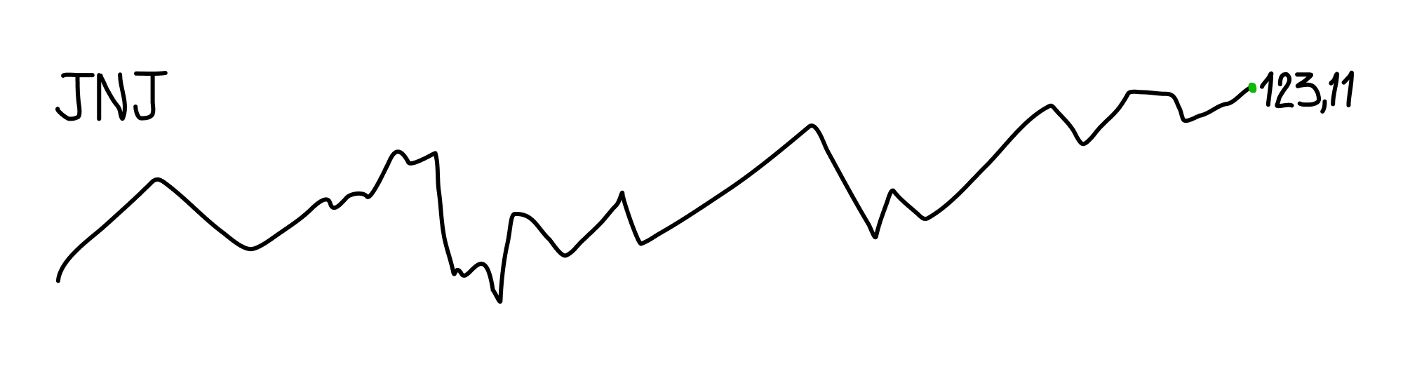
A ticker, current price and a simplified graph, nothing else. Minimal? Yes, just like an effort of the designer who produced this (me).
Increase signal-noise ratio and information density
This principle can be applied to any other interfaces too. Question is in how efficiently we can organize data given limited space and attention of the user within current context. Space can be saved by making data elements multifunctional, resulting in increased information density. Attention of the user can be directed by color, visual accents, type, imagery, etc.
Rather than complementing control elements with additional hints or other elements, better strategy is to increase information density of elements by merging their properties like in this example:
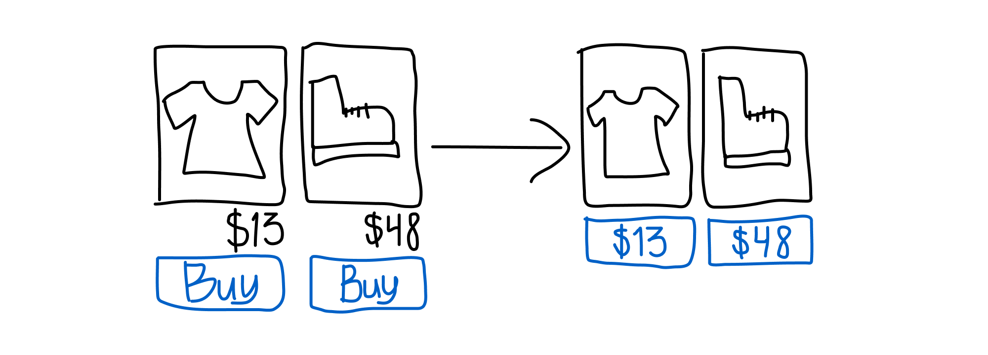
We got rid of repeating Buy label and increased information density of the buttons. Now each button performs two functions instead of one, taking up half the space:
- Performs Buy action
- Shows price
Functionality was not harmed, as button with the price unequivocally tells user what it does. Even if it is not, after one try user will get the grip of it and, as a reward, will avoid seeing a whole battery of 'Buy' buttons every single time.